Moonfare
- Brand Identity
- Campaign
Imagining the new era of private equity investing with an identity and communication platform that juxtapose the classic and contemporary, the clever and witty.


Collaborators
Stonefire – Film and Content Production
Fonts
Signifier – Klim Type Foundry
Waldenburg – Kimera
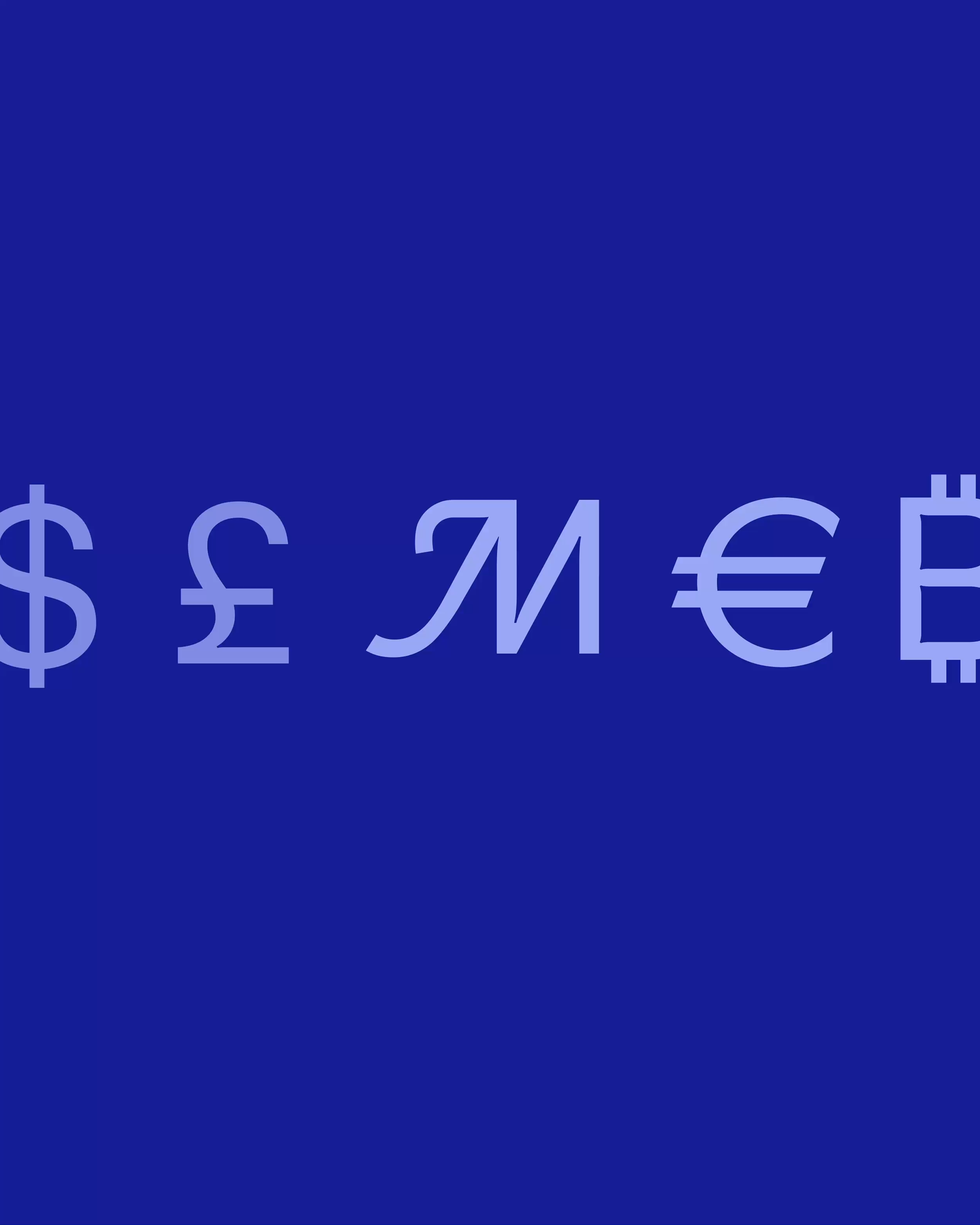
Private equity has historically been an unattainable investment area, accessible only to a select few. Moonfare is on a mission to change that and democratise private equity. In short, it’s a digital platform leading a new era of private equity investing, enabling the world’s most engaged investor community to access expert knowledge and bite-sized private equity investments.
Our mandate was to refine the positioning and brand strategy, crafting an emotional narrative and brand identity that would resonate with a highly sophisticated audience of high-net-worth individuals.
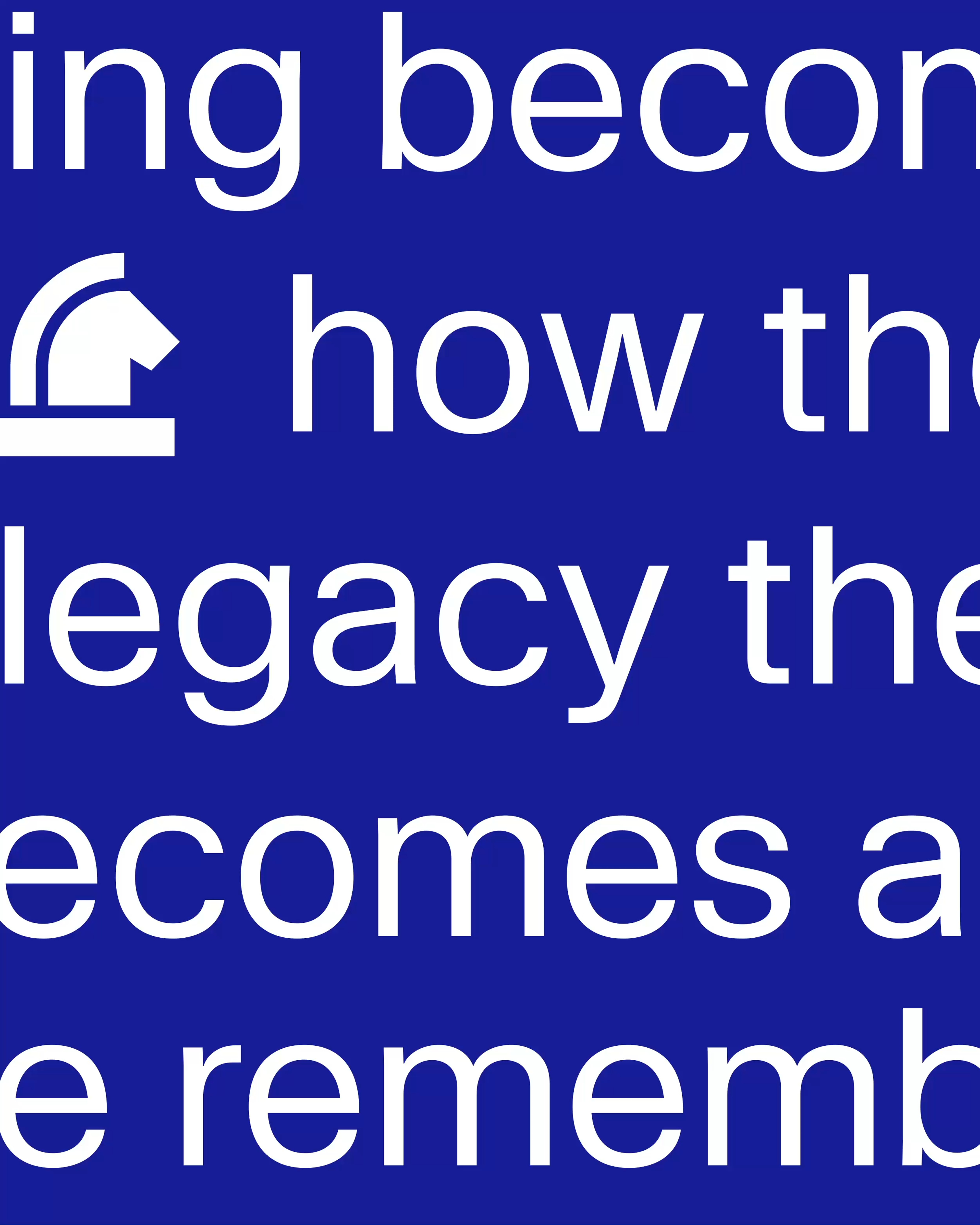
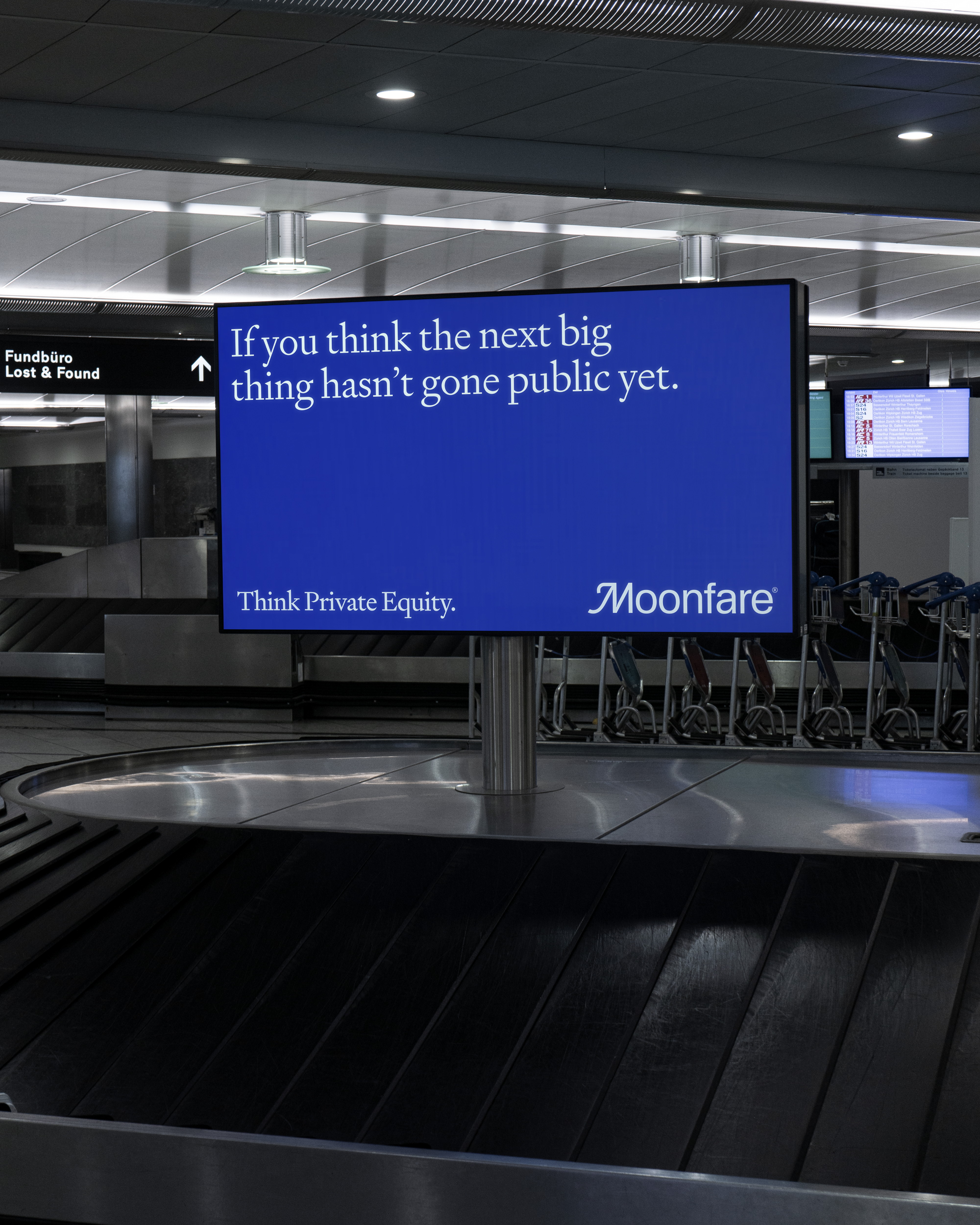
The creative concept is centred around the idea that the true emotional value of investing is legacy. The identity juxtaposes classic and contemporary elements, while the tone of voice strikes the right balance of wit and sophistication. The overall expression aims to engage the audience eye to eye—speaking with them rather than at them—shifting the focus beyond pure performance-driven communication.