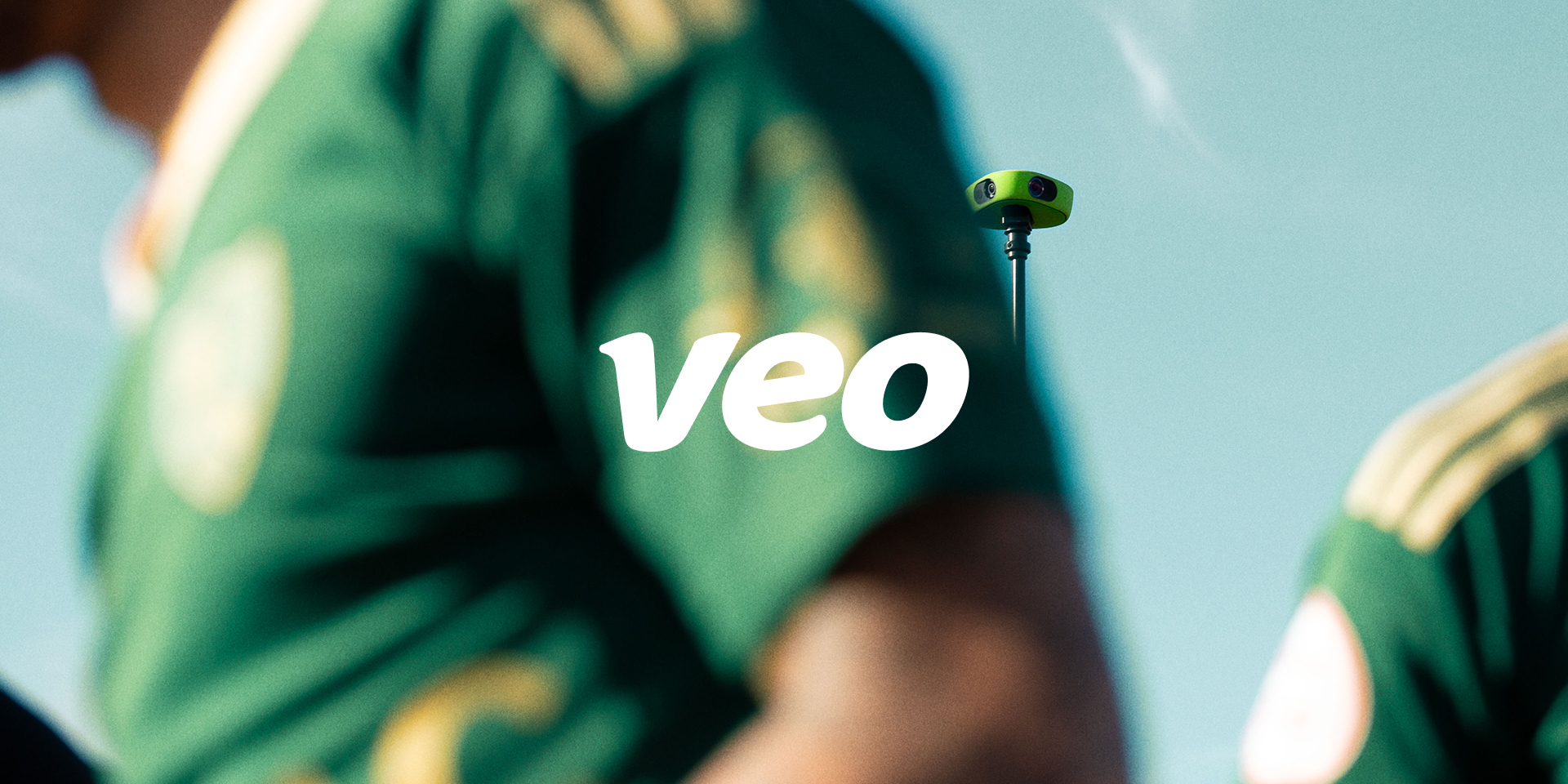
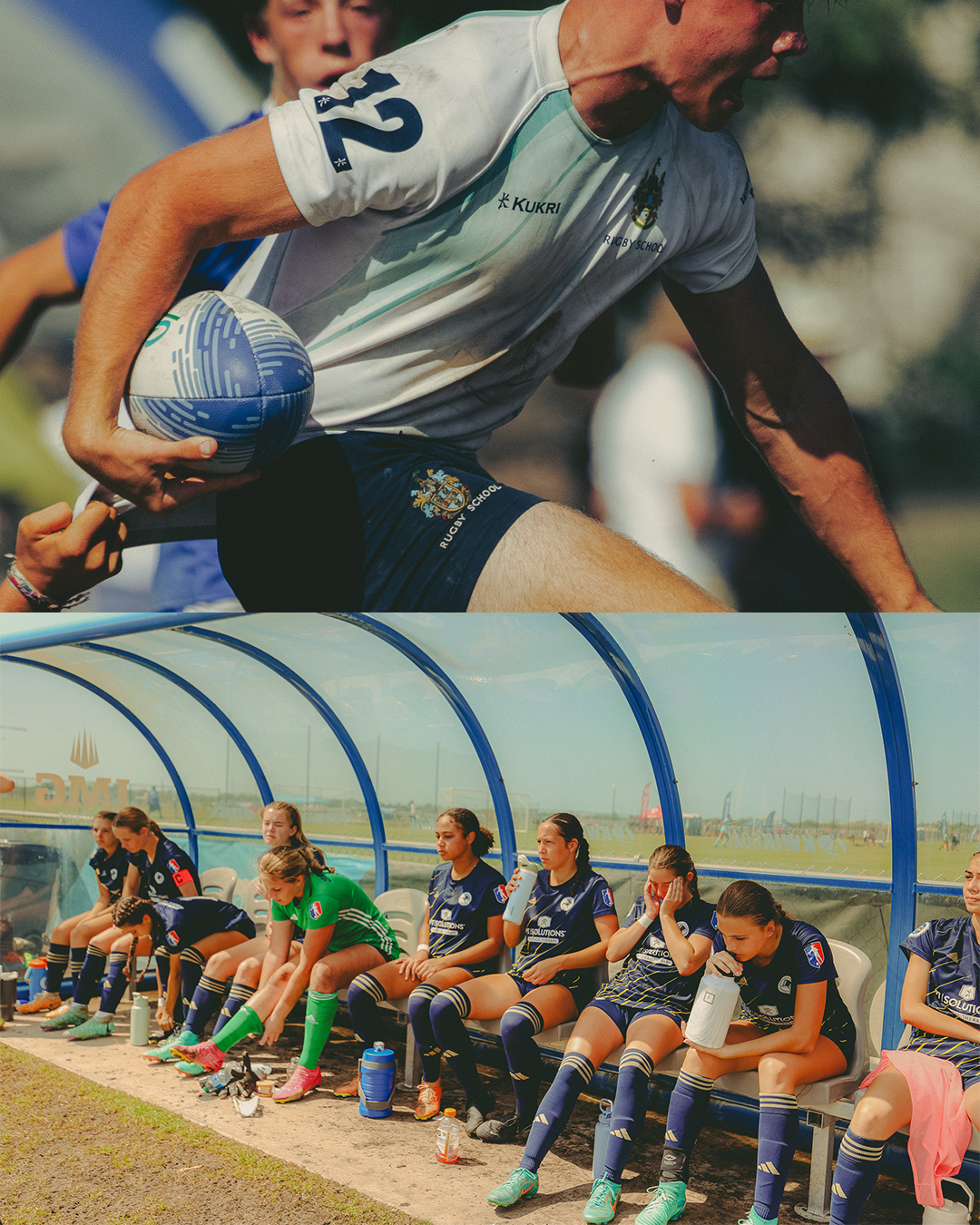
Veo Technologies is a global technology company on a mission to enhance the quality of how sport is played and shared, by making advanced technology more accessible. With the Veo cam 3 just about to launch, Veo set a new aspiration, to move from a technology company to a sports brand enabled by technology. Our task was to refresh the identity to match the new ambition.
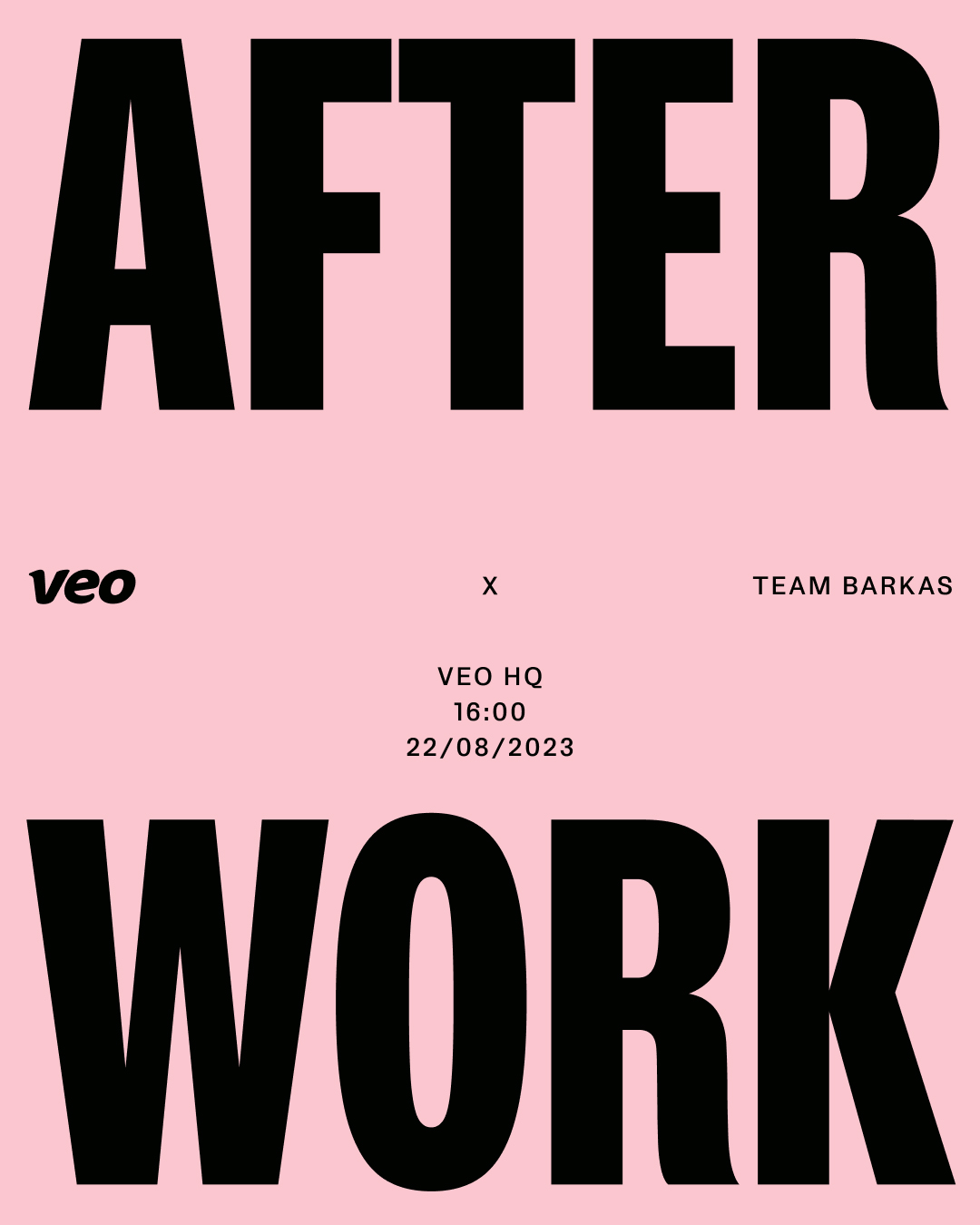
Inspired by the duality of sport, offence and defence, play and progress, back and fourth, we build an identity concept that holds both technology and sports elements. The foundation is clear and simple to keep a coherent base, while the art direction is open and flexible to speak the language of ever changing sports. We are very proud to see the identity rolled out across all touch points, from product, app and web to SoMe and campaigns.
- Client
- Veo
- Industry
- Sports, Tech
- Services
-
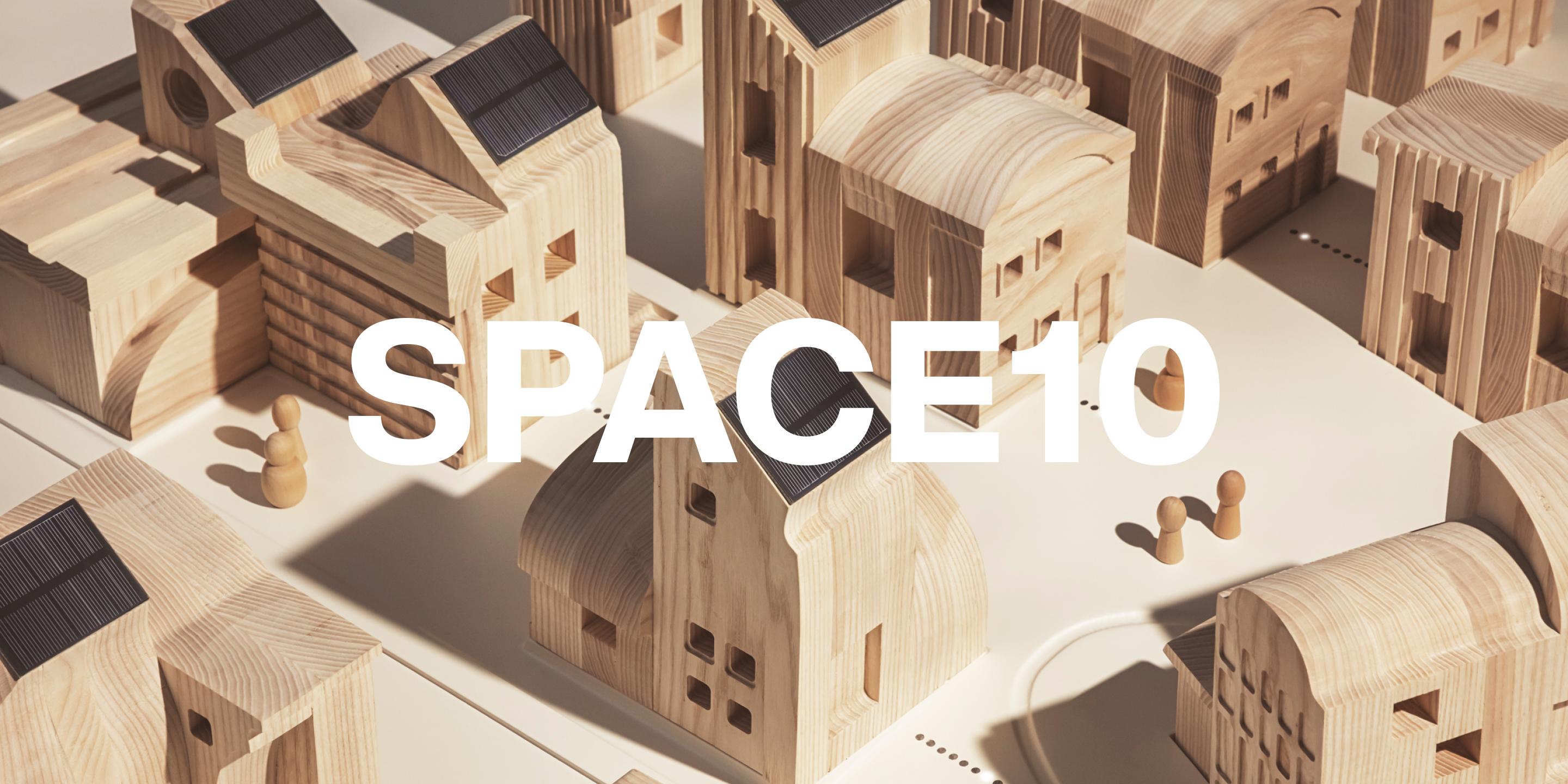
Identity