CET [CPH] [STH]

SPACE10 Website

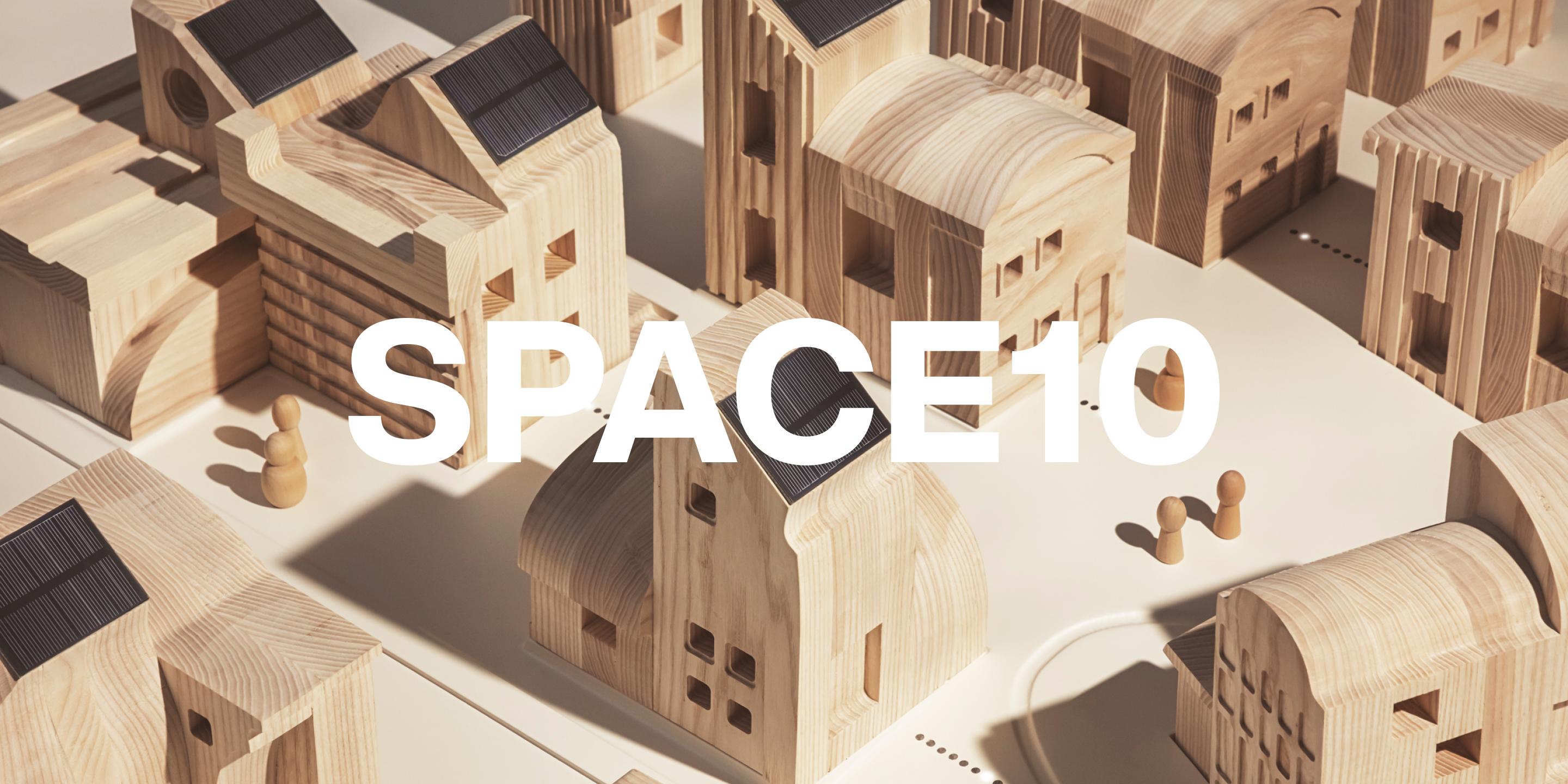
SPACE10’s commitment to inspiring a better tomorrow, lives in its archive website where its legacy is shared with the world.

Client
SPACE10
Industry
Design & Research
Location
Denmark
Services
Design Systems, Digital Branding, Strategy, Website

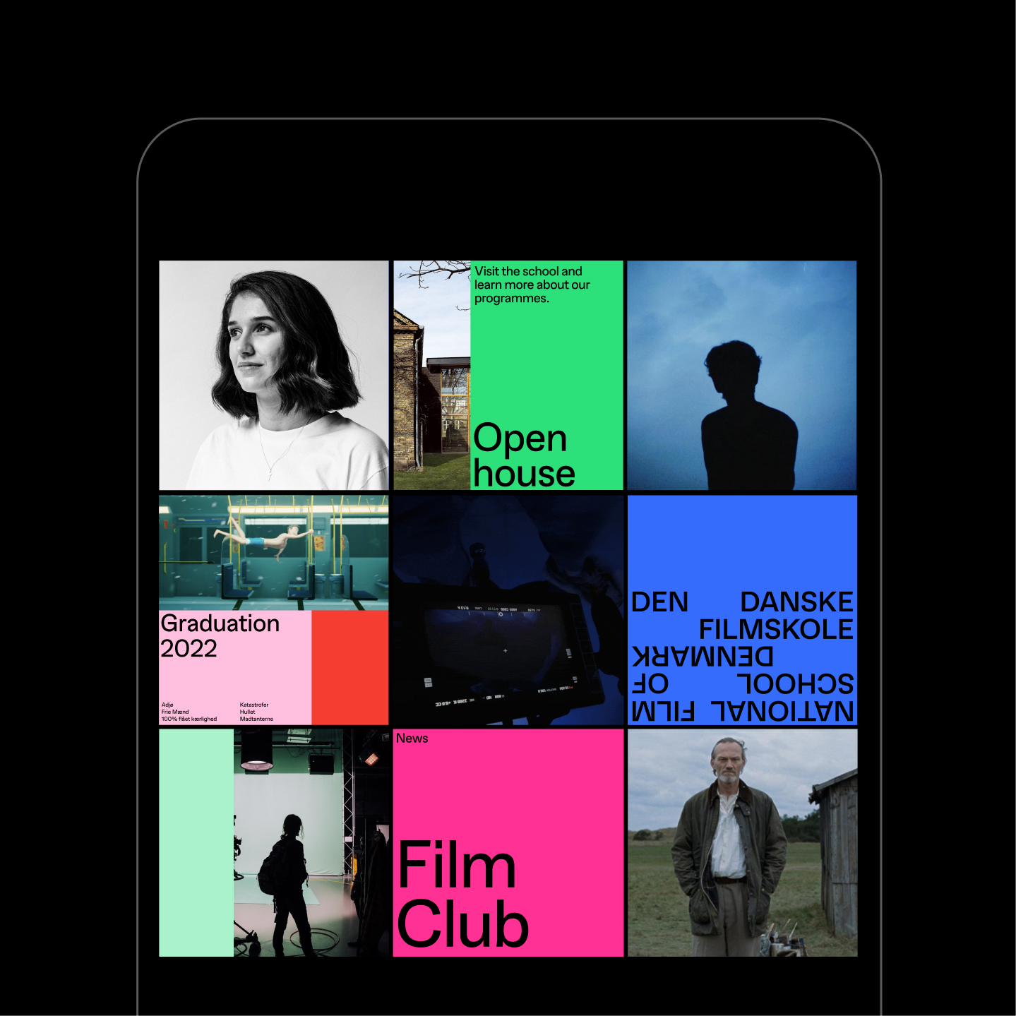
Interactive home page—a nod to DVD screensavers, adding a touch of nostalgia and playfulness to the site.

News widget as a global element accessible across the site.

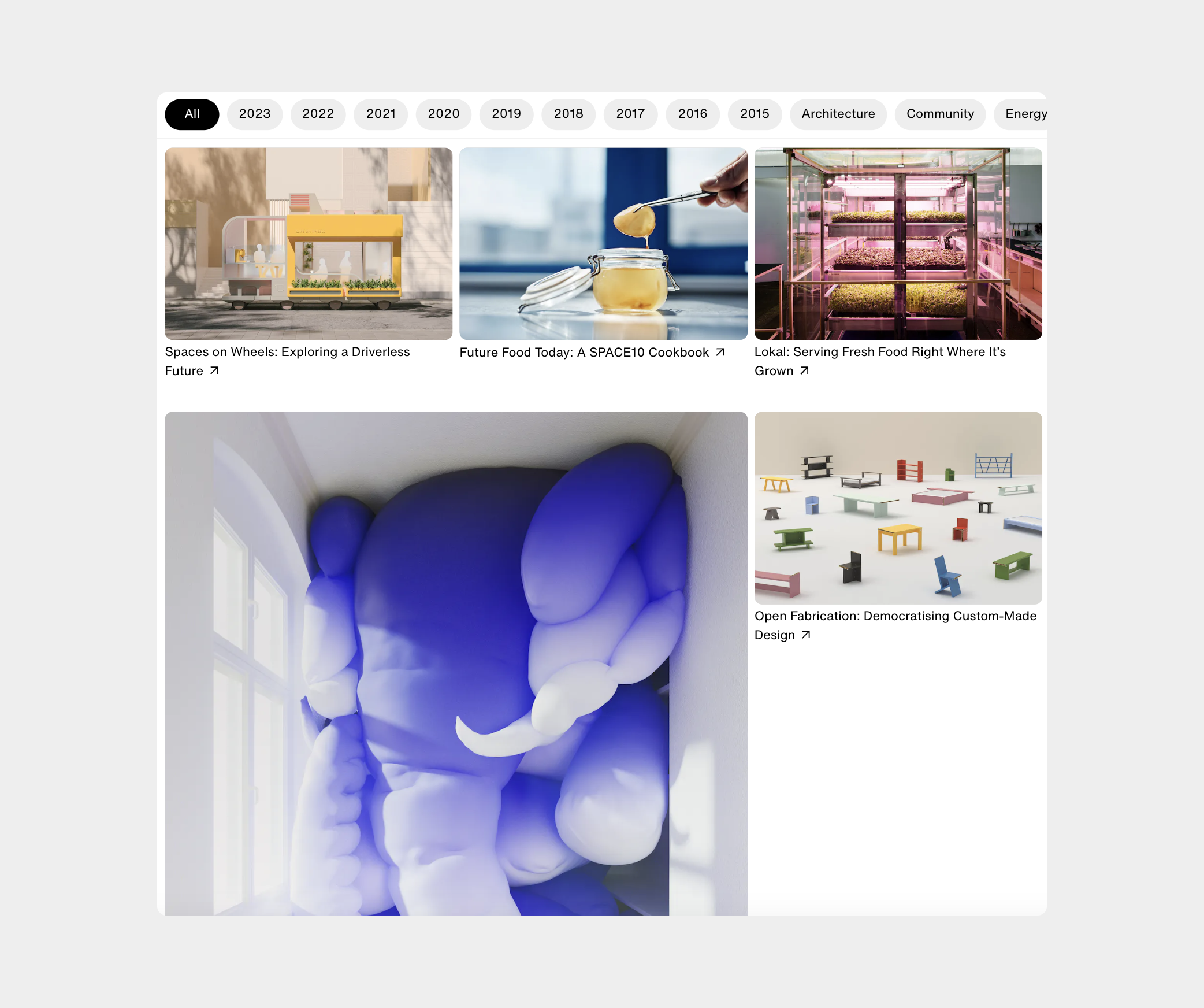
A structured yet flexible grid system with varying thumbnail sizes.

Brutalist approach and a dynamic layout, with overlaying images on text on the project pages.

Image scroll effect on mobile for people images.

Ability to toggle between light and dark mode, reduce animations or turn on low-res images, to reduce energy consumption.

Glossier

Glossier’s success is rooted in its strong and engaged community. In collaboration with Glossier we designed their e-commerce experience, where the voice of the community has a central role. In order to achieve this, we introduced the vision of creating a platform that balances mechanical simplicity with editorial layouts and user generated content.

Client
Glossier
Industry
Beauty
Location
USA
Services
Design Systems, Digital Branding, Strategy, Website

Minimal call-to-actions with engaging hover animations.

The design foundation of having both editorial and mechanical in mind. Combining storytelling with systematic organization of information and products.

Filter to view all shades on the product listing page.

The Blue screen of Gloss.

Glossier footer finishing off the site with a product index and some good vibes.

Community content for the “get the look” feature, elevating Glossier’s passionate community.

Process

Researching the wide product range.

Process

Field research at the London store.

Insempra

Insempra is a biotech company that exists to grow matter with atomic precision, and lead a new generation of superior and sustainable products. We helped interpret the vision into a forward-focused visual expression, where everything grows.

Client
Insempra
Industry
Biotech
Location
Germany
Services
Identity, Strategy, Website
Brand visuals

The visual treatment of photography is developed in collaboration with visual artist pppanik.

Growing logo animation

The Insempra growing logo resembles nature.

Key artworks in combination with the earthy brand colors.


Motion elements.

Key artwork made in collaboration with visual artist pppanik.

Earthy and warm color palette.

IKEA

In 2022 IKEA launched a new collection, Kåseberga, in collaboration with World Surf League. We were part of creating the campaign and brining the collection to life. We made content from five different surf locations around the world, from Portugal to Los Angeles. The campaign was launched across all global IKEA channels.

Client
IKEA
Industry
Furniture, Surf
Location
Älmhult, Sweden
Services
Campaign, Strategy
Campaign logo

Inspired by surf stickers and logomarks, we created a simple visual to be applied across campaign elements.

Launch film

Hero campaign film.

Collection overview

Surf vibes and aesthetics guided the concept for the campaign and collection, which is made with inputs from more than 3500 surfers.

Campaign photography

Key collection image.

Key collection image.

High vibes

Social media

The campaign was launched across IKEA’s global channels.

Campaign photography from five different locations.

IKEA

Since 2014 we have been an ongoing strategic and creative partner for IKEA. The work we have been mandated includes global communication platforms, positioning and range strategy and creative campaigns.

Client
IKEA
Industry
Design, Furniture
Location
Älmhult, Sweden
Services
Campaign, Exploration, Strategy
Range and communication platform

The “Make room for life” platform started as a creative exploration into the future of the living room. The strategy manifested as a new direction for living room range development and a global communication platform.

IKEA x HAY

One of the first brand collaboration by IKEA, was the “YPPERLIG” collection with Danish design brand HAY. We worked on the launch campaign, which was based on a surreal and mysterious film, teasing the use of material without showing any products. Animation: Kühl & Hahn

IKEA Clean Energy Services

Together with IKEA we created the brand strategy and visual universe for “IKEA Clean Energy Services” which is a sub unit at IKEA, exploring and bringing clean energy to more people everywhere.

IKEA Clean Energy Services

The brand photography centers around everyday life and energy.

Sustainable living shop

Campaign for the launch of a shop-in-shop concept in IKEA – The Sustainable Living Shop.

Moonfare

Traditionally Private Equity has been for the wealthy few. Moonfare is on a mission to change this and with a digitalised investment process, open the door to more investors. We helped clarify the strategy, design the visual identity and establish a brand expression rooted in the juxtaposition of modern and classic.

Client
Moonfare
Industry
Finance
Location
Berlin, Germany
Services
Identity, Strategy

To mimic the ease and sophistication of Moonfare, we developed a logo using a clean sans serif typeface combined with a unique and elegant ‘M’ that is reminiscent of a serif monogram.

The Moonfare monogram’s simple lines and curves naturally resembles the known currency symbols.

Striped down graphs combined with a monospace typeface for numerals and financial details

Communication

As a way to stand out in the category, our headlines are intentionally witty.

Moonfare is on a mission to democratize private equity by streamlining, bite-sizing and digitizing the investment process.

Brand idea

We developed the brand idea “Investing is legacy”. It is rooted in the belief that investing is more than financial performance. It becomes an opportunity for people to decide how they want to be remembered — and what legacy they want to leave behind.

Brand film

“Why do we get up in the morning? To pass on what matters.” In collaboration with Stonefire productions we created a brand film for Moonfare to launch the new brand positioning.

Introduction

Founder Dr. Steffen Pauls on stage.

In ‘Introduction to Moonfare’ Founder Dr. Steffen Pauls introduces the idea behind the company. Video created in collaboration with Stonefire productions.

Trustpilot

As one of the most visited websites in the world, and a universal symbol of trust, Trustpilot wanted to manifest their position. We helped them unleash the star and shape an identity that embraces the authenticity and dynamics of what its all about; the reviews.

Client
Trustpilot
Industry
Tech
Location
Copenhagen, Denmark
Services
Design Systems, Identity, Strategy

The star is Trustpilot’s core trust signal, so we brought it to the forefront of their visual communication.

We added Trustpilot Display to the font system to give Trustpilot a typeface they can own, and add a more personal and relatable touch to the brand.

Process

Reviews are not just one or five stars, or red or green. Bad reviews can be the beginning of a better business.

Colours

The colour system is inspired by the review colours, but with a vibrant touch, so they stand out in communication.

Just like the colours, the tone of voice is also inspired by the down to earth and straight forward tone of reviews.

Motion principles

To set the design elements free, we created a set of motion principles that make the creation of moving illustrations easy and fun.

Link

The identity made a big splash at the Amazon Web Services re:Invent 2022 conference in Las Vegas.

Film School of Denmark

Bringing the DNA and legacy of the National Film School of Denmark into a new era with focus on transparency and inclusivity. We shaped an open and colourful visual language inspired by the process and rhythm of filmmaking.

Client
National Film School of Denmark
Industry
Culture, Education
Location
Copenhagen, Denmark
Services
Identity, Strategy, Website
Website
Logotype

The new logo embraces the bilingual challenge and uses it as a way to create a rhythmic expression inspired by editing.

Sign
Layout system

The system is based on a flexible and modular system, that opens up for endless compositions within a coherent frame.

Layout system for instagram

Process

In the research process we looked into different fields of inspiration. We made an audit of the schools legacy and practical needs from a graphic perspective, studied other schools and cultural institutions and the universe of film in general.

Photo credit: Jacob Storm

Student portraits

Photography: Amanda Bødker

GENERATION – Graduation Festival
Poster
Screens
Cinema
Website

Varier

Varier is a Norwegian furniture company with a focus on ergonomic design. We worked with Varier to reposition the brand into a contemporary design brand, with a new visual identity, communciation, collaborations and brand activations.

Client
Varier
Industry
Furniture
Location
Oslo, Norway
Services
Campaign, Identity, Strategy
Logotype
Brand idea

The brand idea is inspired by the philosophy of Norwegian designer Peter Opsvik, who is the man behind many of the iconic Varier designs.

Packaging
Brand film
Ekstrem™ Gentle campaign

Ekstrem™ Gentle campaign is based on a collaboration with the Danish textile company Kvadrat, and features Ekstrem™ in their velvet upholstery.

Ekstrem™ Gentle Campaign

A campaign exploring “extreme gentleness” while saluting the time when the chair was originally designed.

Monochrome print ad campaign for the Ekstrem™ chair.

Process

From extremely gentle campaign.

Shooting a campaign for Variable™, the original kneeling chair from 1979.

Social® ™ Campaign

Launch campaign for Varier’s new collaboration with Snøhetta Social™, a dining chair and so much more.

Social®™ Milan
Social®™ stills & video

Photography by Mishael Phillip

Film by Emir Eralp

Teaser film and stills
Link
Process